How To Optimize Your Website To Help Your Visitors Do Business With You
To conduct business today, a website that is well laid out and important information is easy to find is table stakes. Visitors to your website have ZERO patience if they have to hunt for info like your address, business hours or your phone number! (We’ve all had to search websites for a businesses’ phone number, unbelievable – right?)
And if a visitor to your website can’t find what they’re looking for quickly they’ll bounce to a competitors’ website to see if theirs is any easier to navigate.
In this post, we’ll go over a list of best practices that are key for any business website. These practices are all about making your site user-friendly and engaging, so visitors are way less likely to bail because they’re frustrated or confused.
I’ve also got a handy checklist you can download at the end of this post. It’s a great reference to make sure your site is hitting all these items. So, let’s dig into how you can optimize your website because after all, your website is most customer’s first impression of your business, and a well organized website probably means that your company is pretty efficient too.
First, what is the purpose of your website?
“I don’t know, everybody has a website, I guess I need one”
Nope, your website is a ultimately a conversion tool, meaning it’s there to provide enough information to prospective customers to get them to reach out to you – call, complete a webform, find your address to visit your store – whatever that CTA (Call To Action) specific to your business happens to be.
With that in mind, how do you configure your website so that it best operates as this conversion tool?
Branding
Make sure your logo is positioned at the top of your home page, if you use WordPress you will be able to set it so it appears in the menu bar.
Don’t have a logo? You can make your own on Canva or you can have one made for you on Fiverr or on 99Designs.
Second – be clear “what you do” and if applicable “who you do it for”. Being clear about what you do and posting it on the top (sometimes called the “Hero” banner) is not only useful for people visiting your site but it will help Google understand what you do and might give you some SEO love.
Something like “Commercial Tile Contractor” covers both bases; you’re a tile contractor (what you do) and your clients are commercial not residential (who you do it for).
Remember – YOU know what you do, don’t forget that people new to your company may not know exactly what that is.
Contact Info
Maybe below that headline “Commercial Tile Contractor” add a button that when tapped from a mobile device will initiate a call to your office. You want it to be SUPER EASY to get a hold of you!
In the footer of your website, which should appear on every page, be sure to have your phone, address, etc. so a prospective customer doesn’t have to hunt for it.
Make sure you have a few webforms strategically placed so visitors can contact you after hours.
Service & Product Display
Be clear about your products & services, maybe if you’re “Nick’s Pizza” that’s pretty self explanatory but if you’re company is “Nick’s Industrial Service Company”, what the heck is that? Make the important info easy to find.
I created a website for a chain of Urgent Care offices. The most important thing for them was making a list of their locations immediately available. Along with each address listed we added a “click to call” button and a dropdown with each office’s business hours. That all came about after my daughter went flying over the handlebars on her scooter on a Sunday afternoon. It took me longer than I wanted to find a local Urgent Care (I didn’t know any of their names) that was open and could stitch up her chin.
Ask yourself “what important information does my prospective customer need to know about my company up front?”
Wherever possible, use high quality images or video to display this info.
Navigation
This goes along with the overall theme of making it easy to find information on your website. Are your menus clear? Is the important info up front and well displayed?
Is search enabled on your website so if needed a visitor could click on the magnifying glass to enter a search term?
Call to Action (CTA)
What are your CTAs? Call now? Schedule an appointment? Complete our form? Place buttons on your site that link to a scheduling link on a calendar or initiate a phone call.
Be clear with what you want your visitor to do. Don’t assume that visitors to your website will clearly figure out the next step that you want them to take.
Loading Speed
Once someone either types in your URL on their browser or clicks a link in the search engine results (hopefully you’re showing up there!), how long does it take for your website to “load”? Loading means the time it takes from that click until the time it takes for it to fully come up and be available on the screen.
Forbes shared some website statistics that showed 47% of users won’t wait longer than 2 seconds for a website to load.
That’s not very long. Images that aren’t properly optimized or videos that have to load are the usual suspects when determining why your site is slow to load. You can check out your website’s loading speed with this handy Google tool: Google Page Speed Insights
Enter your URL in the box and it will generate a quick overview of your page loading speed. It also points out specific items to tune which would help your website load faster. Notice at the top of the page you have the option to test your mobile and desktop speed.
Mobile Optimization
Some estimates say that an average of 45% of all website traffic comes from mobile devices. I have B2B clients, selling their services to other businesses, and their percentage of mobile traffic is about 10%, miniscule due to the fact that most of their website visitors are coming from their work laptops. I have a client with a skin care clinic and mobile traffic to her site is over 80%. Regardless of the percentage of visitors to your website using a phone or tablet – mobile optimization is really important!
How to tell how well your site is “mobile-friendly”? Open your website on your phone periodically.
Are the font sizes not too big here one word can wrap on 3 different lines?
Do the CTA buttons work like they should?
How do the menus look?
Is your contact info easy to find?
Refer back to the Google Page Insights tool to understand how your site loads on mobile devices, if it’s slow you should consider asking your web maintenance company to help speed things up. It’s pretty important.
Social Proof
Most customers have their minds just about made up about doing business with you before they reach out which is why your social proof is so important.
If you can, gather customer testimonials to add to a section on your home page. (Bonus points if those customers will permit you to add their photo and name). There are also a number of plugins (apps that enable extra functionality on a website) that will embed your Google reviews on your site as well.
Privacy & Security
Privacy laws have been changing, designed to try to respect people’s privacy online. If you collect any email addresses – say for your newsletter – or people can enter their contact info on a webform etc. you need to have a privacy policy on your website. Add the link in your footer so it’s easy to find.
Your best solution is probably to have your attorney draft one for you, or, there are a number of templates online that you can draft one yourself. This blog is not offering any legal advice but privacy policies are best practices that you should include on your website.
An accessibility statement is something that is becoming more important as well. An accessibility statement is a declaration on a website that outlines the measures taken to ensure the site is usable for people with disabilities. It provides information on the website’s accessibility features, details any known accessibility issues, and offers contact information for users to report accessibility-related problems or get assistance.
Here is an article from the US government office of management & budget on developing a website accessibility statement (click here), there are plenty of resources out there to help you accomplish this.
https://www.section508.gov/manage/laws-and-policies/website-accessibility-statement/
As far as security, use some good password practices. Longer passwords with a combo of numbers, symbols, capital letters, etc. is better than using “Rocky123” or whatever your dog’s name is.
Multi-factor authentication where your website texts or emails you a code or utilizes an authenticator app is highly recommended. There are so many websites out there with little to no security that a few simple steps like complex passwords & multi-factor authentication should help you sleep better at night.
Checklist
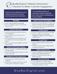
I’ve created a handy-dandy checklist which includes all the items above. Click the button at the bottom of this post to download a PDF version to help with your website optimization project.
Conclusion
Making sure your website loads quickly and is simple to navigate is not negotiable given the number of options most users have today.
Remember, the goal is to make your website a friendly, simple to use, CONVERSION TOOL – to make it easy for customers to engage with your business.
The first step towards enhancing your website’s effectiveness is downloading our website optimization checklist.
Need help?
Use this guide when you have a conversation with your web person and ask them where you stand with all things. If you don’t have such a person to discuss this with, we can help, complete the form below and we’ll set up a call.

